Part 1
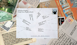
I think that though this may look like several pieces put together randomly, it is clearly communicated. When you read the text, you understand that it's meant to be a timeline. My included written information did not give meaning to the viewer that well, but it does clearly communicate what each element that I have on the timeline represents in my life and I think that even if it's not a paragraph, the viewer is able to understand what I was trying to do.
The best elements in this design, I think, are the letters and the postcards. I think the element that needs the most work done to it is the typography. Something about it just does not sit right with me. I'm not sure if it is the font, the size, or the placement, or maybe even all three.
The message of this poster is to show that throughout my life, the most important and memorable events have been in a myriad of different places.
Overall, I am not ecstatic about this design. I think that a lot more work into it could have made it much better. I would call this poster mediocre at best.
Part 2
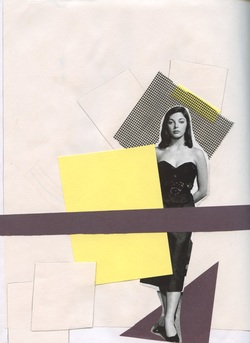
I chose this specific page because I hadn't done anything like it before, and I really loved the way that it turned out. I used a piece from a magazine, some construction paper, a small piece of a screen, and pencil. This page is about loneliness. The woman is by herself with a look of what I see as indifference. Though she is lonely, she feels fine about it. This page stands out to me out of all my pages because of the color contrast. I made the decision to add some yellow into an originally black and white design because I knew it would create some contrast and make the design much more interesting. I made a collage on this page, which I had not done prior to this piece. I actually ended up loving it and have started to do more collage-like things in my sketchbook.
 RSS Feed
